Love it or hate it, Helvetica stands as one of the world’s most iconic and widely used fonts, found in advertising, publishing, and urban signage. But what underpins its success and widespread adoption, and how has it evolved over the years?
As its name hints (derived from ‘Helvetia’, the Latin term for ‘Switzerland’), Helvetica was born in Switzerland. It was in 1957 that Eduard Hoffmann, director of the Haus foundry in Münchenstein, commissioned freelance designer Max Alfons Miedinger to create a new typeface. Hoffmann aimed to challenge the rising popularity of Akzidenz Grotesk, a competing typeface from the H. Berthold AG foundry. Miedinger's creation, initially named Neue Haas Grotesk, was a sans serif font characterized by its linear, clean, and elegant design. This minimalistic aesthetic made it exceptionally legible and contributed to its enduring appeal.
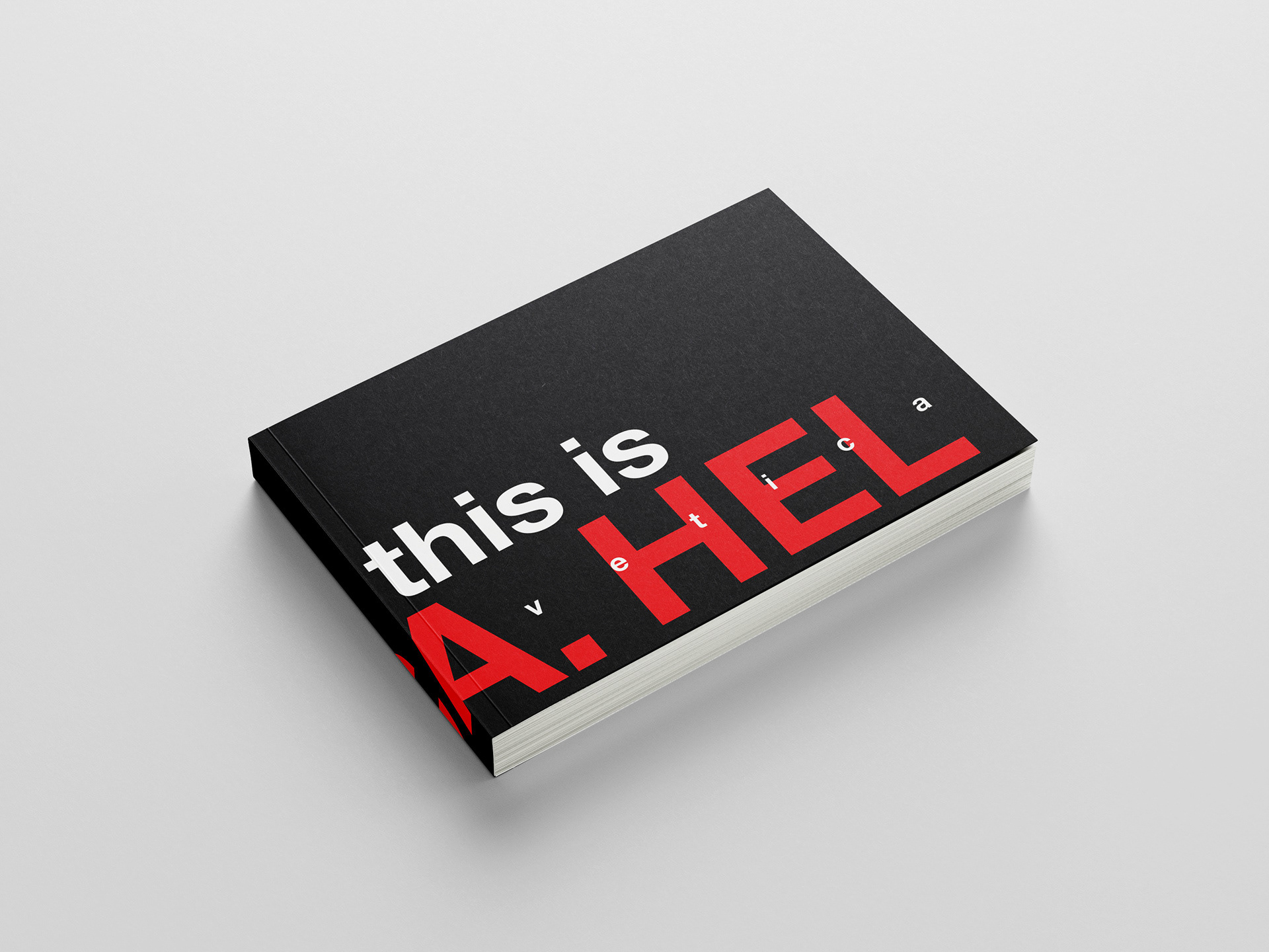
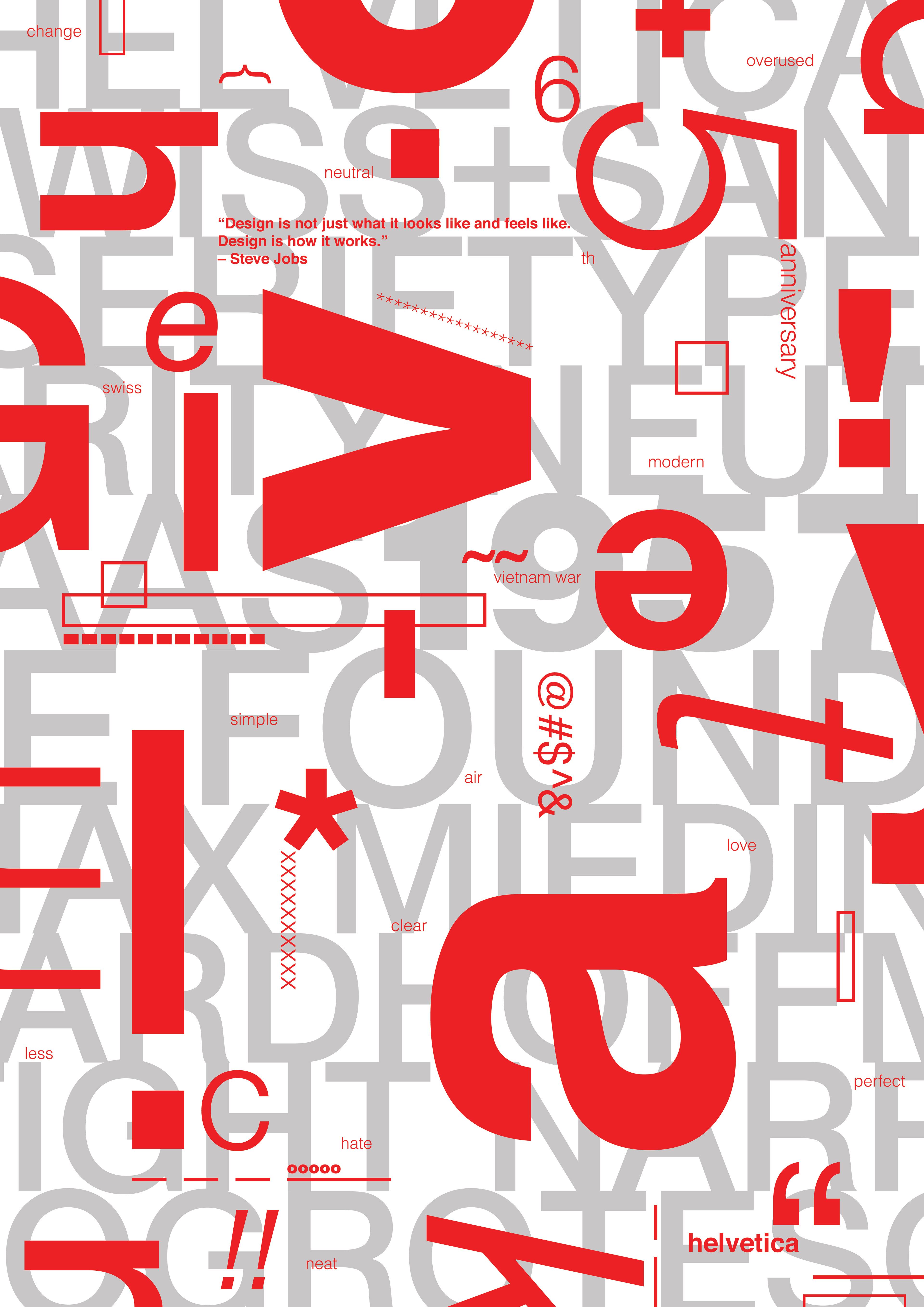
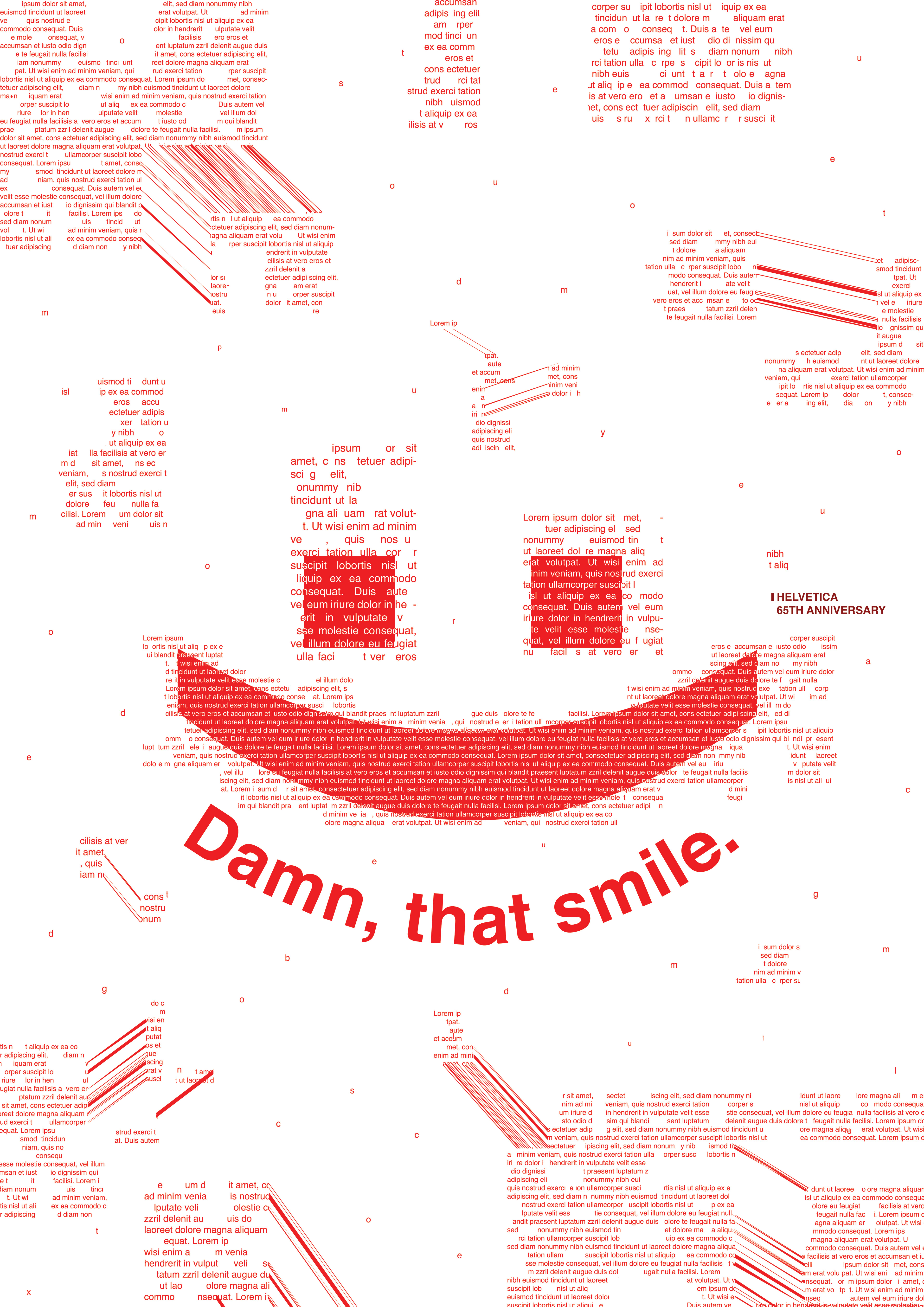
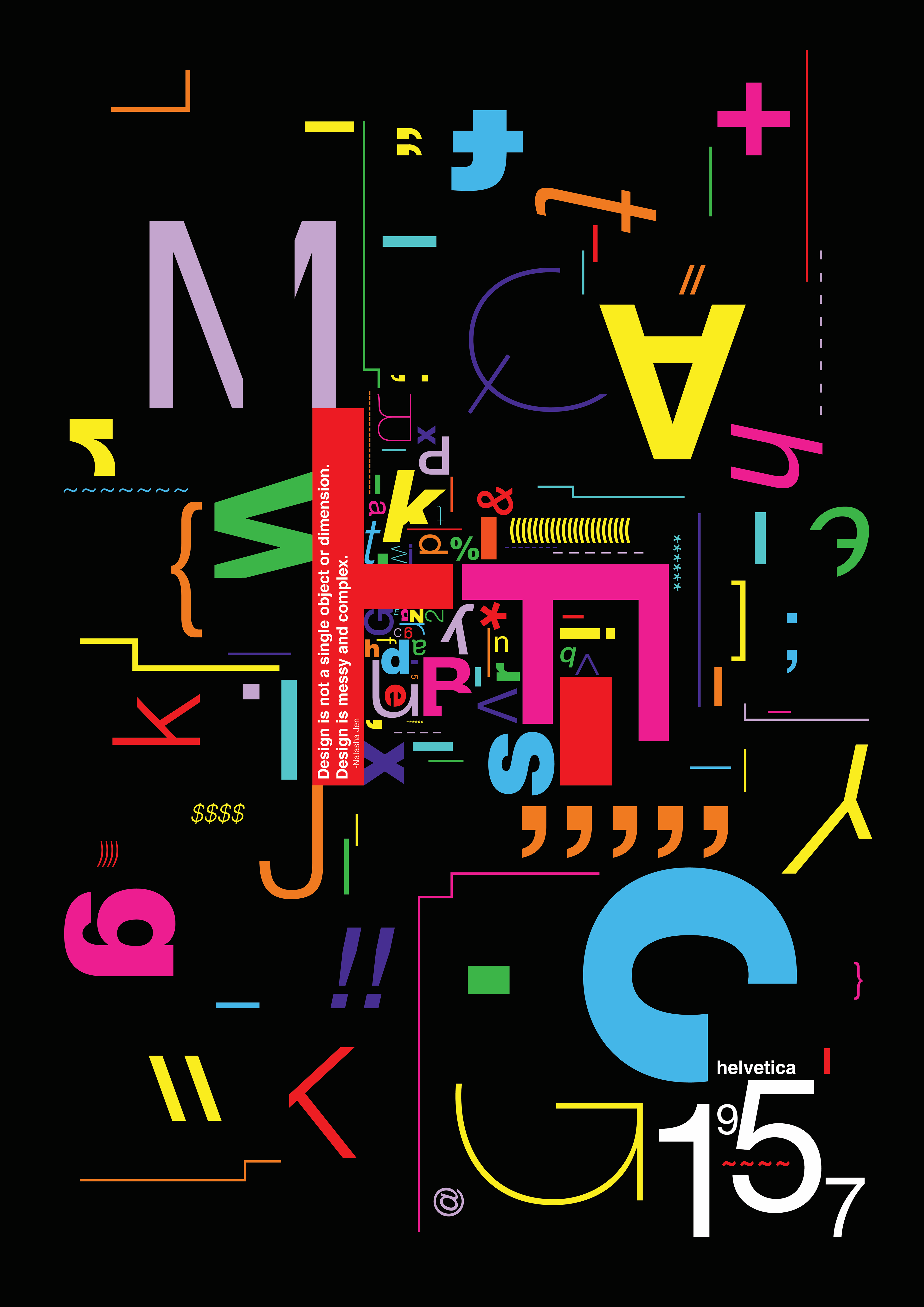
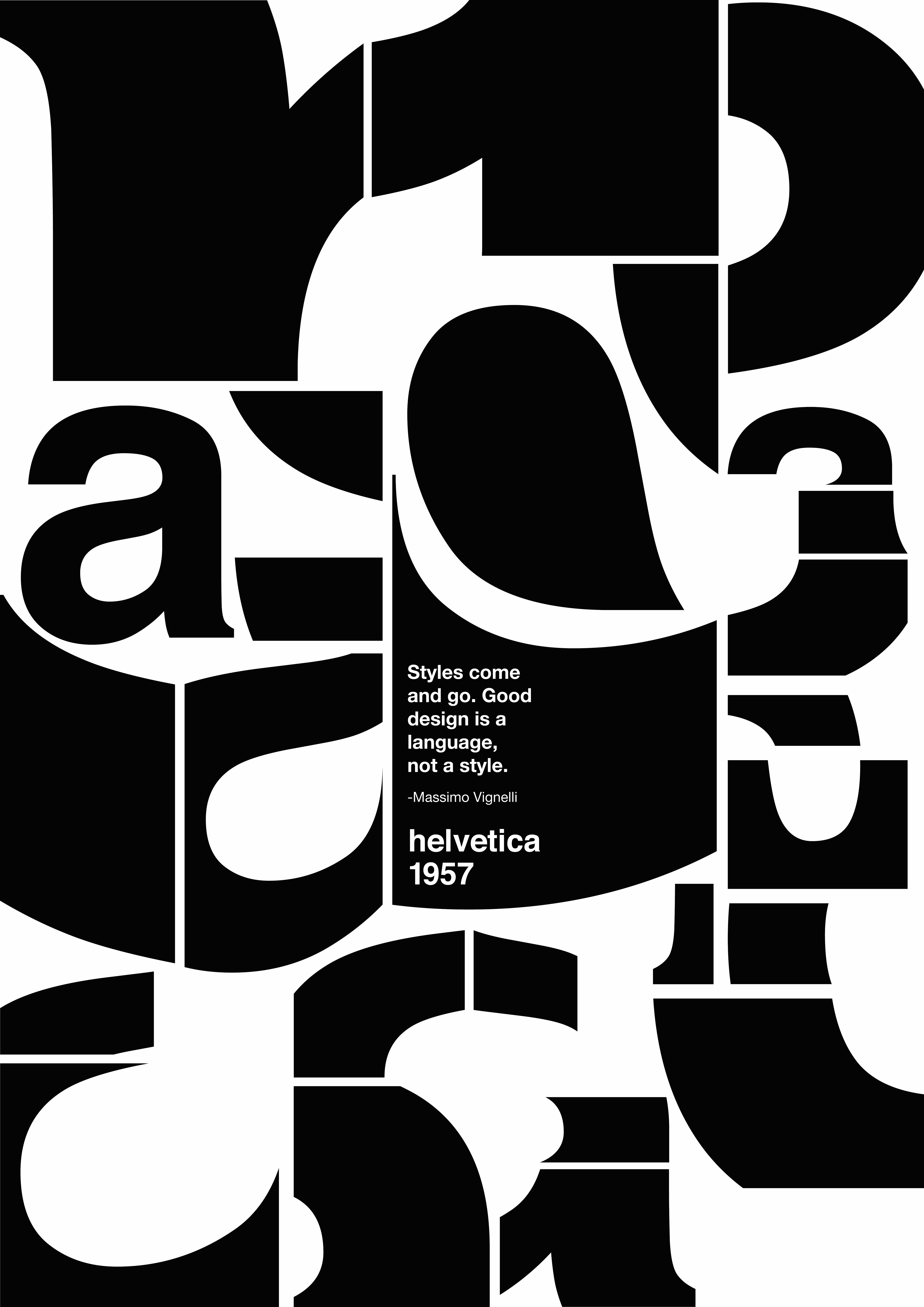
This exploration of Helvetica and its impact was the focus of a project I completed during my third year of university in the course Advanced Typography.
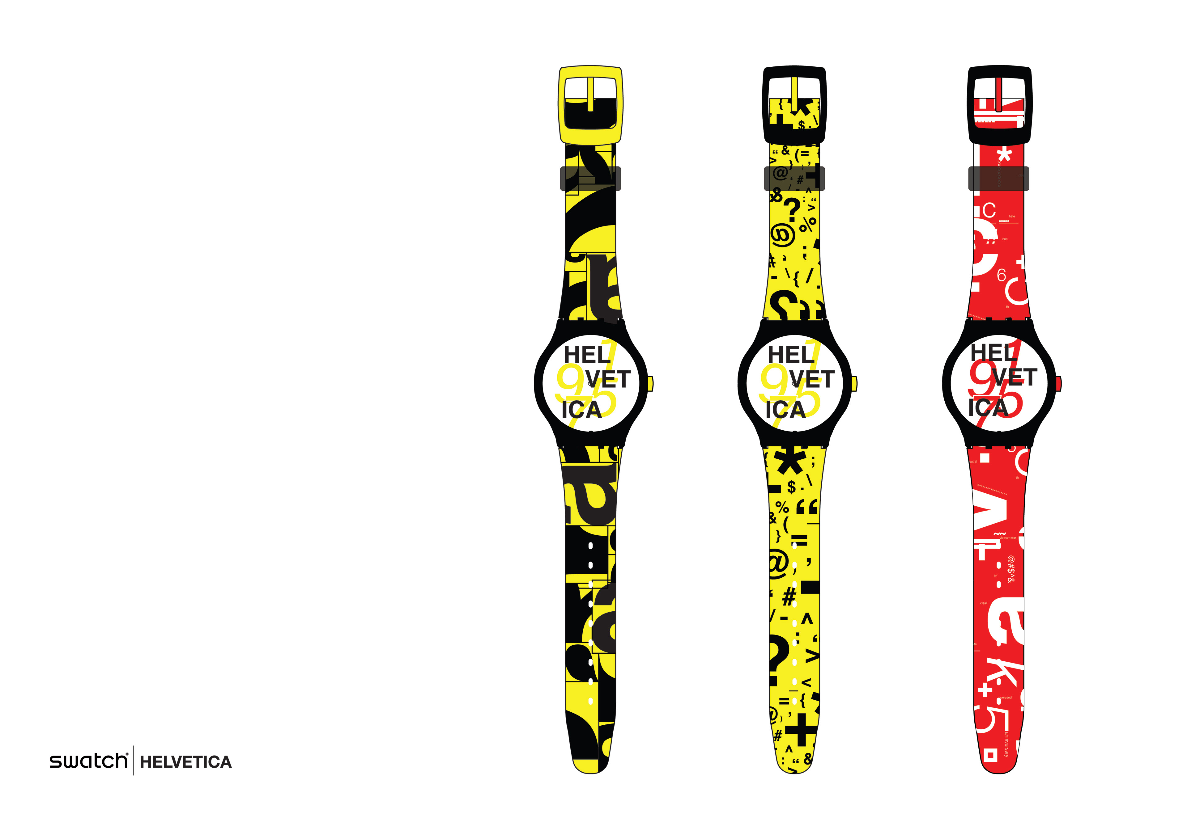
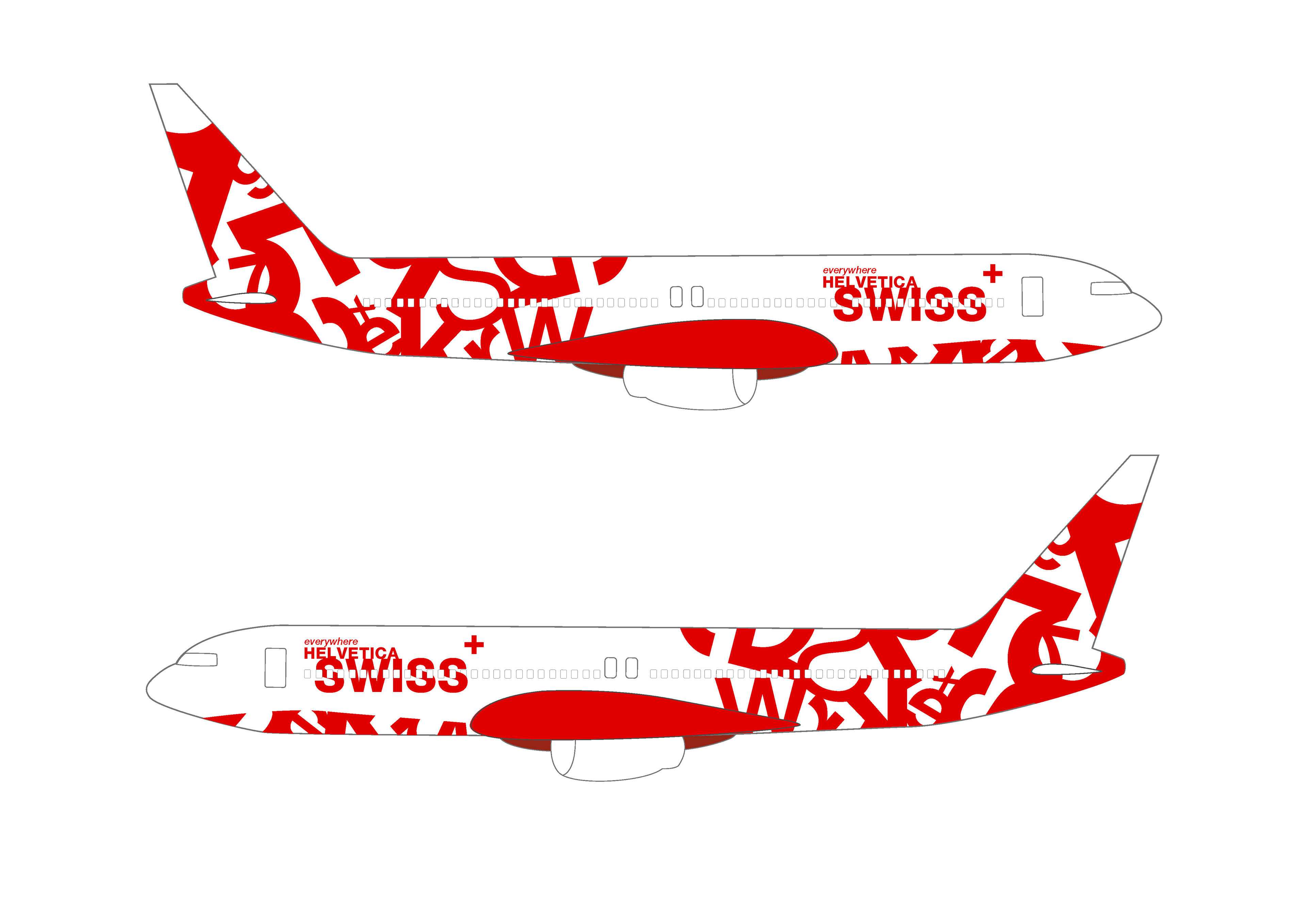
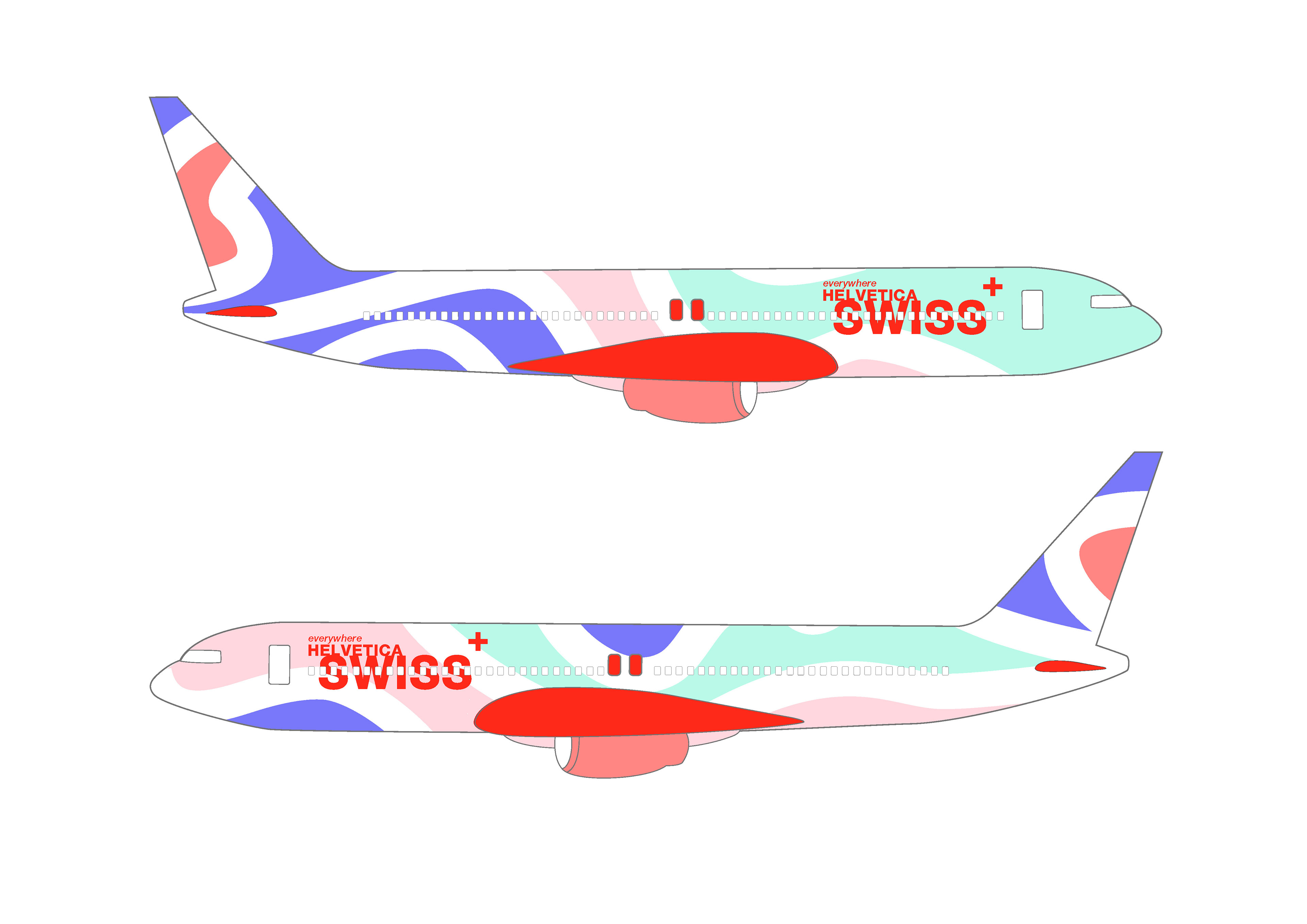
Postcard, Swatch Watches, Airplanes

Helvetica Phone Case
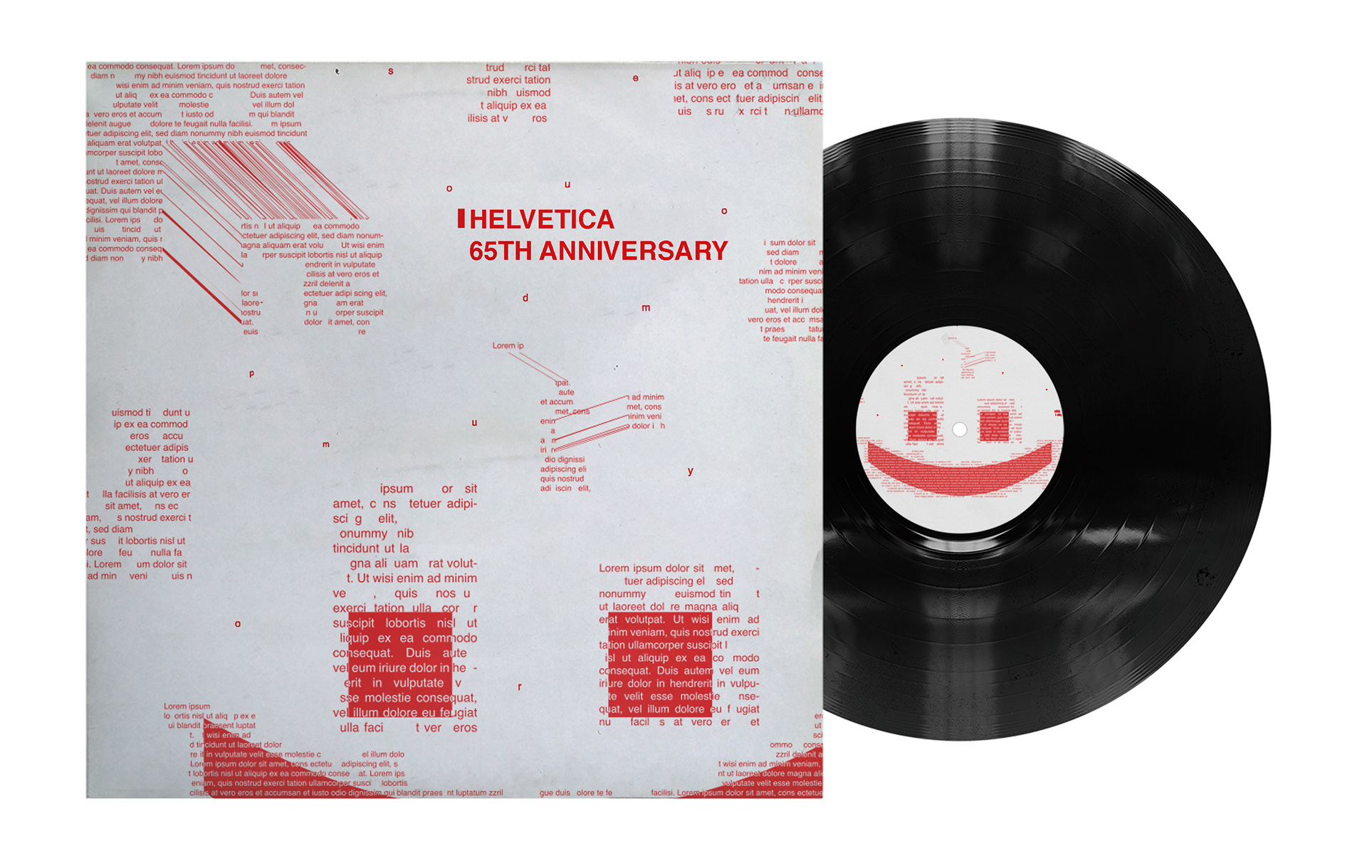
Helvetica 65th Anniversary Vinyl
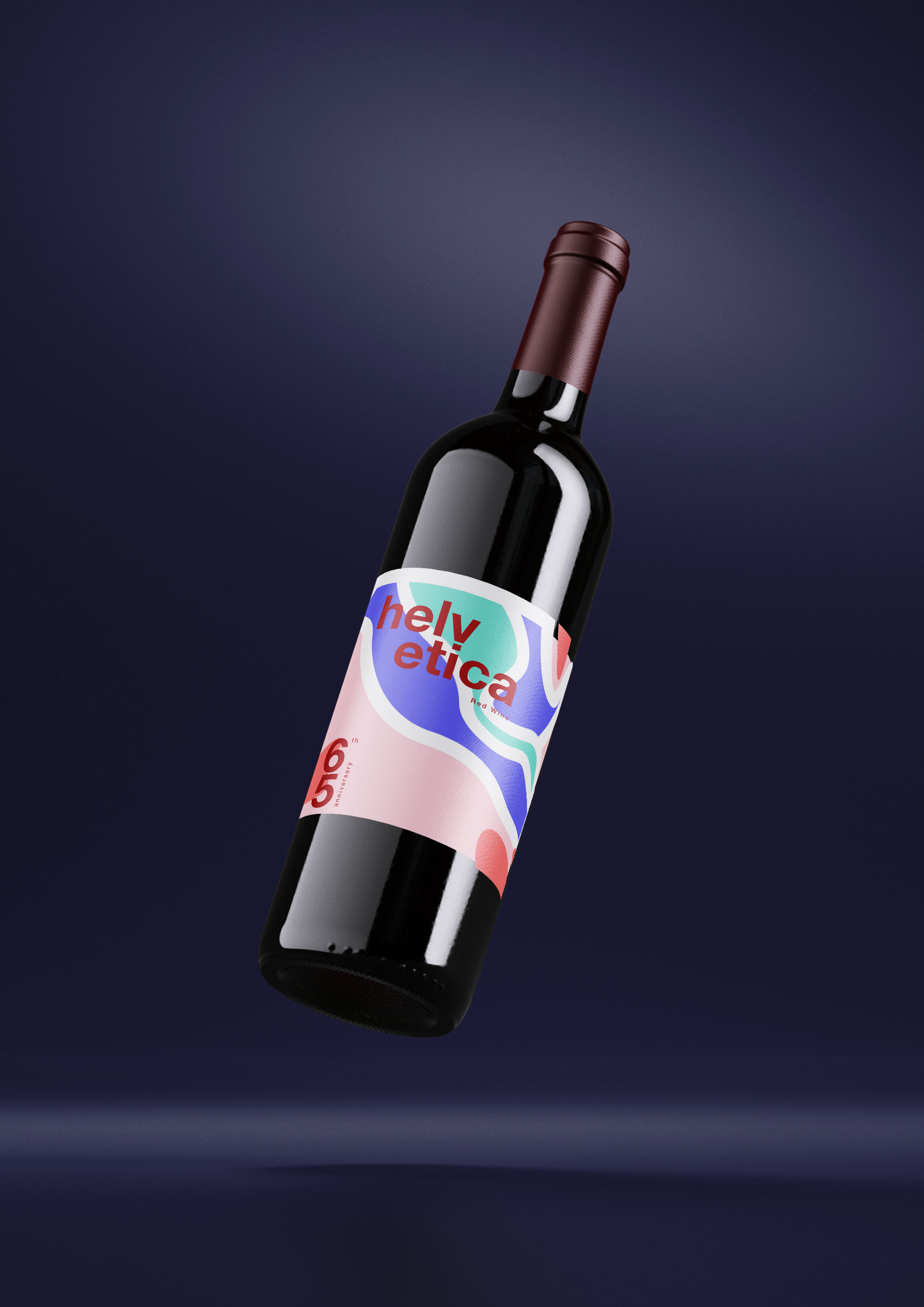
Helvetica Wine